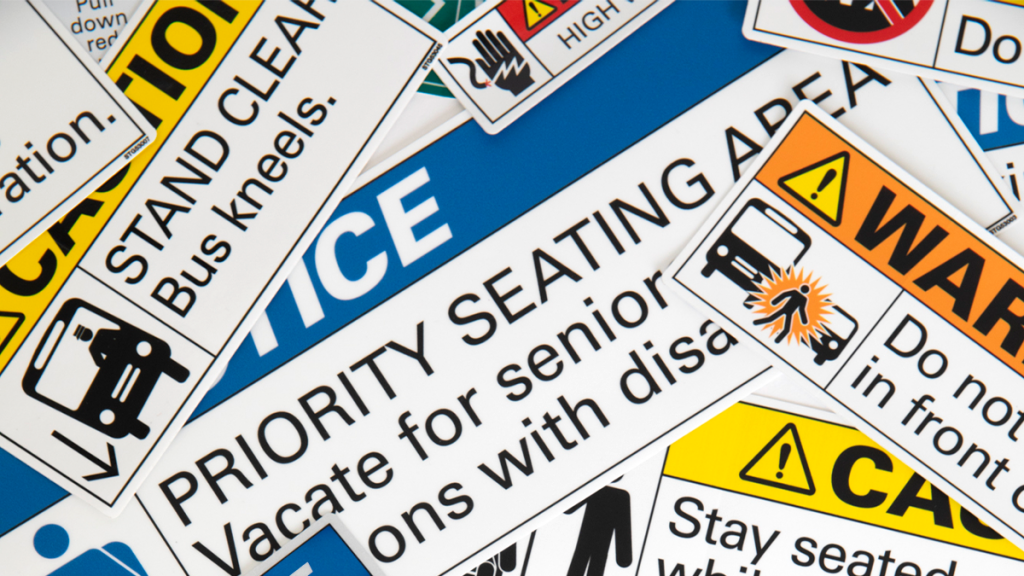
Introducing ANSI via our ANSI guru.
Safety decal design! Sounds exciting, right? Maybe not to some, but to us, it’s what we do for a living! But what makes a good safety decal design? What makes something “stick out” or “pop”? We sat down with our safety decal design guru and asked him the questions we get asked the most about why and how we design our Safety Standards the way we do!
How did you choose the elements and messages that go into your safety decal package?
In the beginning we analyzed what messages the major transit authorities around the country were using. From that we started a list of essential messages to have on the vehicle that is meant to warn passengers, operators and maintainers of rules and safety hazards. Then came the design. We researched a number of different design methods and landed on one that was developed by ANSI.
What the heck is ANSI?
ANSI stands for American National Standards Institute. It’s a private non-profit organization that oversees the development of voluntary consensus standards for products, services, processes, systems, and personnel in the United States.
Where in the world is ANSI a standard?
ANSI is specifically defined for the United States but we have used our decals for customers in Canada because it’s a standard that works for all!

Why do you choose to use ANSI for your design standard?
During our discussions with the customers, we found there was a need to get away from aesthetically based design and move towards a design that was objective and had purpose. We always get asked the question: “Why should I use your red and not my purple?” Now we have a reason for helping customers understand the purpose behind all of the design decisions that went into developing our Safety Standards
What standard do you follow when creating safety messaging decals for transit?
We specifically follow the Z535 set. Included in this set is all of the design criteria for everything that is included in our safety decals.
Why use a standardized design?
There are a lot of reasons! My personal favorite is uniformity that a design standard creates! Walking on a customer’s bus seeing all of the same fonts, colors, and symbols satisfies the design nerd in me.
Who was ANSI designed for?
For everyone! The Z535 committee defines their scope as the following: To develop standards for the design, application and use of signs, colors, and symbols intended to identify and warn against specific hazards and for other accident prevention purposes.
Can anyone design ANSI?
Sure can! The best thing about following a specific standard is that there are very detailed instructions on how to design so anyone can do it!
What happens if I want my own design?
No problem! We have some customers that mix and match. Some customers take advantage of our custom design services to redesign the decal using ANSI symbols, fonts and colors to help keep the uniform look within the vehicle.
My message isn’t about safety, should I still use ANSI?
Absolutely! We always suggest designing in the ANSI standard to keep uniformity throughout your fleet. Uniformity is beautiful!
OK, why do some customers use a combination of ANSI and non-ANSI?
Personal preference. Some marketing departments want their marketing messages to match the look and colors of their brand identity!
So, we had a lot more questions than we thought (oops!)
We are going to take a break here and get into the more technical design questions in a part 2 of pestering our safety decal design guru.

